
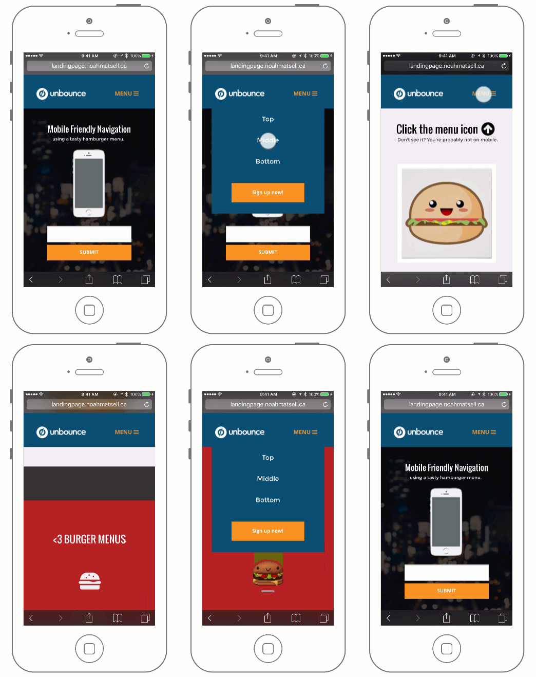
Building on the Sticky Navigation Bar Community Post, this tutorial shows you an easy way to take your navigation bar in Unbounce and make it mobile friendly.
The benefit of doing this is to give your users a way to quickly navigate your mobile landing page while allowing them to jump to the form at any time.
See this effect in action here (view on mobile):
http://landingpage.noahmatsell.ca/mobile-menu/
How to Install in Unbounce
🚨 This is not an official Unbounce feature. This functionality is based entirely on third party code, and has only been tested in limited applications. Since this isn’t a supported Unbounce feature, our support team will be unable to assist if things go awry. So if you are not comfortable with HTML, Javascript and CSS, please consider consulting an experienced developer.
⚠️ Before We Begin…
If you don’t have your navigation bar set up yet, start here.
Download the Scripts
Grab the latest
menu_box.css
and menu_toggle.js
files here:
Mobile Hamburger Menu
Optional: Download the .unbounce template
You can download the .unbounce file for this project here.
Instructions
Step 1.
Copy your navigation bar box element in desktop, switch to the mobile editor,
and paste the box on your page. This will be your mobile dropdown menu! Style
to your liking.
Step 2.
Still in mobile, you will now want to hide the buttons in the original navigation
bar and add your toggle button/image.
Step 3.
Switch to the desktop editor and hide the newly created dropdown menu box element.
Step 4.
Copy and paste the following snippet to the Javascript section with placement
‘Before Body End Tag’.
<script src="//ajax.googleapis.com/ajax/libs/jquery/1.4.2/jquery.min.js" type="text/javascript"></script>
This is the reference to the jQuery library. Next, paste the menu_toggle.js Javascript code below the snippet.
Step 5.
Replace “#lp-pom-image-120” with the ID of your toggle button/image from Step
2 and both instances of “#lp-pom-box-113” with the ID of your menu box created
in Step 1.
Step 6.
Paste the
menu_box.css
CSS code in the Stylesheets section.
Step 7.
Replace “#lp-pom-box-113” with the ID of your menu box from Step 1 and the ‘top’
value with the pixel height of your original navigation bar.
Testing:
Like anything else you implement on your page, you’re going to want to test this
out thoroughly to see what effect (if any) it has on your conversion rates. We
recommend running an A/B test and segmenting a small portion of traffic towards
the page - just to be safe.
Conclusion:
We’ve given you the ground work, but we would love to see how you implement this
on your own pages. For example, maybe you choose to make your header fully transparent
and only include a menu icon? This is your chance to get creative and show the
Unbounce community how you’re using this.